Designing a direct mail appeal is a tricky process. It’s easy to get lost in the sea of design options and end up with something that doesn’t quite fit your needs. So how do you decide what to include? In this article, we’ll walk you through all the different appeal design components that go into designing your direct mail appeal.
The Direct Mail Piece Is a Piece of Art
First, a direct mail piece appeal is an investment in your nonprofit or school. It’s designed to convert inquiry into action and spark first impressions. The success of your appeal depends on the design as much as it does on the content and copywriting.
Designers use color, imagery, fonts, and graphics to create an emotional response. When you send a direct mail piece, there are a few important appeal design options to consider:
-
The purpose of the mailing is clear through the images and headings. Draw the eye throughout the piece to tell the story even if skimmed through.
-
The design should create an emotional response that resonates with the potential donor. This is true for direct mail pieces because they have such a long life.
-
The genetic make-up of what’s included in your direct mail piece can influence or turn away your donors. Are you sending a letter with a buck slip and reply card? Are you including a premium in your mailer?
How to Fit All that Information
Designing a direct mail appeal is not just about creating an aesthetically pleasing piece. It is about creating an information heavy piece that requires careful attention from the designer. It is important to have a balance of images, icons, and headings to create a clean and organized design.
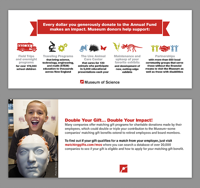
With the rise in popularity of infographics as marketing tools, nonprofits are using them more often in their appeals. Creative designers see an opportunity to use these graphic visuals. These add value and help readers understand complex topics or information.
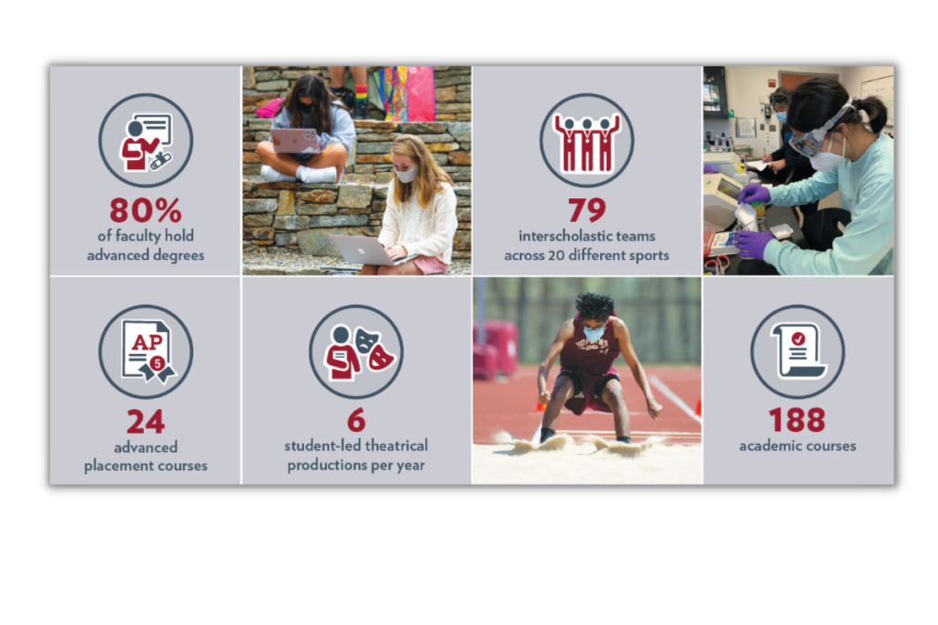
Icons provide a significant amount of instant recognition for appeal design options. Icons are often used to represent various data points in different ways. For example, in the image, you can visualize the point that the appeal is trying to make. The next time you see an icon, take a moment and think about what it might mean.
Choosing the Right Appeal Format
All the appeal design options now lead you to determine the format. The type of format that you choose for your direct mailer should depend on:
- your budget,
- the message you are trying to convey,
- and the desired reach.
For a more personal message, the letter format is best. However, it can be an expensive option. This makes postcard or self-mailers formats more suitable for a less expensive choice.
In addition, when considering a letter format, it offers a personalized message that is printed on high-quality paper with an envelope. A letter provides a more personalized piece to the donor. It is best used when you have time to write an engaging letter.
Self-mailers are a great way for nonprofits to create interaction between recipients and their mission. We typically use these mailers as an extension of a campaign, providing information about the overall goal. Including a donation form perforated on the bottom makes it easier for the donor to return.
Postcards are a less expensive alternative to a self-mailer because it requires less copy. However, the postcard needs to show impact through a firm base of imagery. Our clients use the postcard for alumni events, fiscal year-end reminders, and save the date for giving days.
Incorporating White Space in Your Design
Now that you’ve chosen your format, content, graphics, imagery, reply card, etc., it’s important not to crowd your appeal. White space is the empty area between the distinct elements of your design.
This design element is the empty area between the distinct elements of your design. It’s an artful way to use design to create a visual separation of your content. The lack of overcrowding in content allows for readers to focus on what you’re trying to say.
Using white space is crucial for sending out a postcard or other type of direct mail. Cutting back on clutter and having some blank space gives the reader a chance to consume what they’re reading. Including a minimal amount of white space will make it easy for your target audience to navigate through the message and head straight to your ask. Keep it simple!
What to Do with All These Appeal Design Options
A strategically and creatively designed appeal will give you the best chance of standing out in the mail. Separate yourself from the dozens of other companies who are also vying for the attention of your constituents. Being able to rise above the crowd with high-quality and intentional direct mail designs, stellar copy, and personalization throughout your mailers will position you and your nonprofit for success.
Need help with the design of your next appeal? We have graphic designers on staff who specialize in delivering a well-designed appeal. Designing nonprofit mail is just one of the many services we offer. Let us know if we can help you with any of your marketing needs.